Prüfpunkte
Create BigQuery Views
/ 50
Create BigQuery Data source
/ 50
Visualizing Data with Google Data Studio
- GSP197
- Overview
- Setup and requirements
- Task 1. Prepare your environment
- Task 2. Connect to Data Studio to visually analyze the dataset
- Task 3. Create a scatter chart using Data Studio
- Task 4. Adding additional chart types to your report
- Task 5. Creating additional dashboard items for different departure delay thresholds
- Task 6. Creating the remaining dashboard views (optional)
- Congratulations!
GSP197

Overview
This lab demonstrates how to use Google Data Studio to visualize data stored in Google BigQuery.
The US Bureau of Transport Statistics provides datasets that contain data on commercial aviation, multimodal freight activity, and transportation economics, which can be used to demonstrate a wide range of data science concepts and techniques. This lab uses a dataset containing historic information about internal flights in the United States.
Objectives
- Create BigQuery views
- Create a BigQuery Datasource in Google Data Studio
- Create a Data Studio report with a date range control
- Create multiple charts using BigQuery views
Setup and requirements
Before you click the Start Lab button
Read these instructions. Labs are timed and you cannot pause them. The timer, which starts when you click Start Lab, shows how long Google Cloud resources will be made available to you.
This hands-on lab lets you do the lab activities yourself in a real cloud environment, not in a simulation or demo environment. It does so by giving you new, temporary credentials that you use to sign in and access Google Cloud for the duration of the lab.
To complete this lab, you need:
- Access to a standard internet browser (Chrome browser recommended).
- Time to complete the lab---remember, once you start, you cannot pause a lab.
How to start your lab and sign in to the Google Cloud console
-
Click the Start Lab button. If you need to pay for the lab, a pop-up opens for you to select your payment method. On the left is the Lab Details panel with the following:
- The Open Google Cloud console button
- Time remaining
- The temporary credentials that you must use for this lab
- Other information, if needed, to step through this lab
-
Click Open Google Cloud console (or right-click and select Open Link in Incognito Window if you are running the Chrome browser).
The lab spins up resources, and then opens another tab that shows the Sign in page.
Tip: Arrange the tabs in separate windows, side-by-side.
Note: If you see the Choose an account dialog, click Use Another Account. -
If necessary, copy the Username below and paste it into the Sign in dialog.
{{{user_0.username | "Username"}}} You can also find the Username in the Lab Details panel.
-
Click Next.
-
Copy the Password below and paste it into the Welcome dialog.
{{{user_0.password | "Password"}}} You can also find the Password in the Lab Details panel.
-
Click Next.
Important: You must use the credentials the lab provides you. Do not use your Google Cloud account credentials. Note: Using your own Google Cloud account for this lab may incur extra charges. -
Click through the subsequent pages:
- Accept the terms and conditions.
- Do not add recovery options or two-factor authentication (because this is a temporary account).
- Do not sign up for free trials.
After a few moments, the Google Cloud console opens in this tab.
Activate Cloud Shell
Cloud Shell is a virtual machine that is loaded with development tools. It offers a persistent 5GB home directory and runs on the Google Cloud. Cloud Shell provides command-line access to your Google Cloud resources.
- Click Activate Cloud Shell
at the top of the Google Cloud console.
When you are connected, you are already authenticated, and the project is set to your Project_ID,
gcloud is the command-line tool for Google Cloud. It comes pre-installed on Cloud Shell and supports tab-completion.
- (Optional) You can list the active account name with this command:
- Click Authorize.
Output:
- (Optional) You can list the project ID with this command:
Output:
gcloud, in Google Cloud, refer to the gcloud CLI overview guide.
Task 1. Prepare your environment
This lab uses a dataset, code samples, and scripts developed for Data Science on the Google Cloud Platform, 2nd Edition from O'Reilly Media, Inc. and covers the data visualization tasks covered in Chapter 3, "Creating Compelling Dashboards".
Clone the Data Science on Google Cloud repository
- In the Cloud Shell, enter the following command to clone the repository:
- Change to the repository directory:
Schema exploration
This lab uses a BigQuery dataset that has been pre-loaded with two months of sample flight data for January and February 2015, which was obtained from the US Bureau of Transport Statistics. The flight data is in a table called flights_raw in the dsongcp dataset.
-
In the Cloud Console, expand the Navigation menu (
) and select BigQuery.
-
In the Explorer panel on the left, expand your project and
dsongcpdataset, then select theflights_rawtable. -
On the right side of the window, select the Schema tab to see the schema of the
flights_rawtable.
For a quick look at a BigQuery table, use the Preview functionality.
- Click on the Preview tab to view the
flights_rawtable.
Create BigQuery views
Create some table views to easily see flights that are delayed by 10, 15 and 20 minutes respectively. You'll use these views later in the lab.
- In Cloud Shell, run the script
./create_views.sh:
- Run the following script to compute the contingency table for various thresholds:
Task 2. Connect to Data Studio to visually analyze the dataset
-
In a new browser tab, open Looker Studio.
-
If needed, click Use it for free.
-
Click Data sources in the top menu.
-
On the top left, click + Create > Data source.
-
Select a Country and provide a Company name.
-
Agree to the Terms of service and click Continue.
-
Select No for all email preferences, then click Continue.
-
In the list of Google Connectors, click the BigQuery tile.
-
Click AUTHORIZE to enable access from Data Studio to your Cloud sources.
-
If needed, be sure your lab account is selected, click ALLOW.
-
Click to select MY PROJECTS >
[Project-ID]> dsongcp > flights. -
Click the blue CONNECT button on the upper right of the screen.
Task 3. Create a scatter chart using Data Studio
-
Click CREATE REPORT at the top right of the page.
-
Click ADD TO REPORT to confirm that you want to add the
flightstable as a data source. -
Replace Untitled Report in the top left with your name for this report.
-
Since you'll create your own charts, click to select, then delete the automatically created chart.
-
Click Add a chart > Scatter chart, then draw a rectangle on the report canvas to hold the chart.

In the right panel, the DATA tab lists the data properties.
- In the DATA tab, click the field for the settings below and change to the following:
| Field | Value |
|---|---|
|
Dimension |
UNIQUE CARRIER |
|
Metric X |
DEP_DELAY |
|
Metric Y |
ARR_DELAY |
- Hover your mouse over the data type icon (SUM) of the Metric X property.
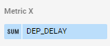
- Click the pencil icon to edit the aggregation type of Metric X.
-
Change the aggregation type to Average.
-
Click outside the aggregation type box to return to the property pane.
-
Do the same for Metric Y to change the aggregation type from SUM to Average.
-
Click the STYLE tab.
-
In the Style menu click the Trendline drop-down and select Linear.
-
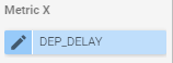
In the ribbon above the report, click Add a control > Date range control.
- Draw a rectangle the size of a label below the chart to add the Date range control.
Try it out!
- Set a date range between January 1, 2015 and February 28, 2015 by either:
- Clicking Auto data range in the Date range control Properties panel on the right.
- Clicking the Date range control rectangle you added under the scatter chart.
- Click the VIEW button on the upper right to change to the interactive report view to test this control.
Task 4. Adding additional chart types to your report
-
Click Edit on the upper right to add more chart items.
-
Click Add a chart > Pie chart, then draw a rectangle on the report canvas to hold the pie chart.
-
With the pie chart selected, click ADD A FIELD on the bottom right of the Data tab in the right panel.
ADD A FIELD option, refresh your browser tab.
-
Click Add calculated field to view the field property summary.
-
Click ALL FIELDS to view the field property summary.
-
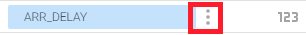
Click the context menu icon to the right of the
ARR_DELAYfield (three dots) and select Duplicate.
-
Click + ADD A FIELD on the top right of the section.
-
Click Add calculated field and name the field
is_late. -
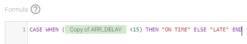
In the Formula text box enter the following formula:
The field name must register correctly. If you do not see the syntax highlighting as shown below, double check the formula or use the Available Fields selector on the right to select the Copy of ARR_DELAY field.
-
Click SAVE and then click DONE.
-
In the DATA tab in the right panel, change the Dimension for the Pie chart to the new is_late calculated field.
-
Change the Metric to the new is_late field.
-
Hover over the CTD icon next the is_late metric.
-
Click it and change the aggregation to Count.
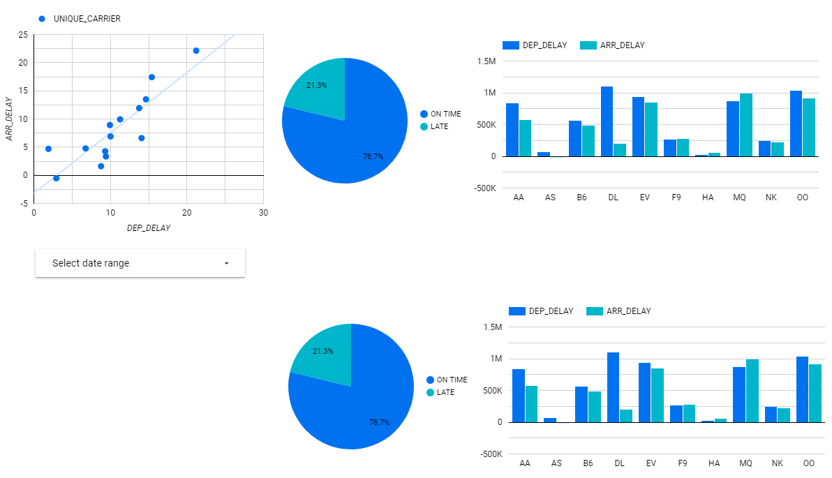
The pie chart now displays the percentage of on time and late flights.
Add a bar (column) chart
-
Click Add a chart > Column chart, and then draw a rectangle on the report canvas to hold the bar chart.
-
In the DATA tab, click the field for the settings below and change to the following:
| Field | Value |
|---|---|
|
Dimension |
UNIQUE CARRIER |
|
Metric 1 (Default) |
DEP_DELAY |
|
Metric 2 (click Add metric) |
ARR_DELAY |
|
Sort |
UNIQUE CARRIER |
|
Sort Order |
Ascending |
- In the STYLE tab, scroll to Right Y-Axis and set the Axis Min value to 0.
Task 5. Creating additional dashboard items for different departure delay thresholds
You've created 3 database table views. Now create charts to display the delay thresholds for these tables.
Add an additional data source for the Delayed_10 database table view
- Copy the pie chart and the bar chart so that you now have two sets. The report canvas should now look similar to this:
-
Select the second pie chart and click flights in the Data Source in the property list.
-
Click + ADD DATA at the bottom of the menu.
-
Click BigQuery in the Google Connectors section of the selection pane.
-
Select MY PROJECTS >
[Project-ID]> dsongcp. -
Click the delayed_10 table to select it and then click ADD button on the bottom right of the screen.
- Click ADD TO REPORT.
Recreate the copy of the Arr_Delay field and the is_late calculated field
-
Click + ADD A FIELD on the bottom right of the screen. You may need to make sure you have selected the DATA property tab on the right hand side of the screen to see this.
-
Click Add calculated field to view the field property summary.
-
If you cannot see the full list of fields with their data type and Aggregation type displayed then click ALL FIELDS to go to the field property summary.
-
Click the context menu icon to the right of the
ARR_DELAYfield and select Duplicate.
-
Click + ADD A FIELD on the right side of the screen for the delayed_10 data source.
-
Enter
is_latein the Field Name text box. -
Enter the following formula in the Formula text box:
The field name must register correctly. If you do not see the syntax highlighting as shown below then double check the formula or use the Available Fields selector on the right to select the Copy of ARR_DELAY field.
-
Click SAVE and then click DONE.
-
Now change the Data Source for the new pie chart to
delayed_10. It should retain the is_late calculated field.
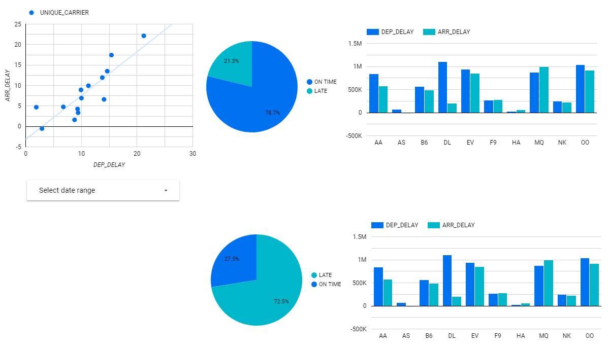
The second pie chart now displays the percentage of on time and late flights for the Delayed_10 view.
Task 6. Creating the remaining dashboard views (optional)
Optionally repeat the last two sections, where you added an additional database view for the Delayed_15 and Delayed_20 views.
Congratulations!
You used Google Data Studio to visualize data stored in BigQuery tables and views.
Finish your quest
This self-paced lab is part of the quest, Data Science on Google Cloud. A quest is a series of related labs that form a learning path. Completing this quest earns you a badge to recognize your achievement. You can make your badge or badges public and link to them in your online resume or social media account. Enroll in this quest and get immediate completion credit. Refer to the Google Cloud Skills Boost catalog for all available quests.
Take your next lab
Continue your quest with:
Next steps / learn more
Here are some follow-up steps:
Data Science on the Google Cloud Platform, 2nd Edition: O'Reilly Media, Inc.
Google Cloud training and certification
...helps you make the most of Google Cloud technologies. Our classes include technical skills and best practices to help you get up to speed quickly and continue your learning journey. We offer fundamental to advanced level training, with on-demand, live, and virtual options to suit your busy schedule. Certifications help you validate and prove your skill and expertise in Google Cloud technologies.
Manual Last Updated March 08, 2024
Lab Last Tested March 08, 2024
Copyright 2024 Google LLC All rights reserved. Google and the Google logo are trademarks of Google LLC. All other company and product names may be trademarks of the respective companies with which they are associated.